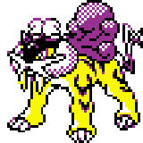
#5 - Ho-Oh in Pokémon Silver Version

Pokémon Gold and Silver Versions were the second paired titles to be released, spearheading the second generation of the franchise in 1999. These are the only two games in the entire series to have different sprites between each version, so this was a very unique and pleasing aesthetic touch.
Both versions have their stinkers and their greats. Ho-Oh, a fire type legendary Pokémon based on a phoenix, had quite an intimidating sprite in Gold Version. Silver Version? It looks like a chicken. Just look at it and go BWWAARRRKK and you'll see how much it fits. The silly stretched tongue is bad enough, and the awkward, congested portrayal makes it look incredibly small and pathetic. As with many sprites in these games, the colour is completely wrong, but this is more forgivable. It just fails to make Ho-Oh look remotely intimidating or majestic, and instead reduces it to a silly piece of poultry. In comparison, here is Ho-Oh's sprite in Gold Version...

Still the wrong colour, but much cooler. Silver Version got majorly screwed over.
There are much worse sprites than this, I admit, but we needed some variety. Otherwise this list would have nothing but Red and Blue in it...
#4 - Rhydon in Pokémon Red and Blue Versions

Spoke too soon.
Rhydon is a monstrous lizard like rhino thing from the very first generation of Pokémon; as seen on the left in the official artwork. On the right sits it's sprite in Pokémon Red and Blue Versions, the very first Pokémon games ever released.
You're probably thinking the same thing as me: what in christ's name is this? The head is ridiculously oversized, or perhaps his body is undersized. Either way, the effort to cram Rhydon's shape into the small screen fails miserably. What's up with his Pinocchio like horn? What's up with his left hand? Is it broken? Has he got some serious bling? Nothing about this sprite captures the character whatsoever. It's like Rhydon's equivalent of Bowser, Jr.

On the left is the official artwork of Blastoise, the final evolution of Squirtle, a starter Pokémon introduced in the very first generation. On the right, the official sprite in Pokémon Red and Pokémon Blue Versions.
Seems odd that Nintendo would approve of such a bizarre design that makes Blastoise look like the leader of some sort of Pokémon mafia gang. Either that or he is perpetually inflating within an undersized shell that's ready to explode. The smug grin also seals the deal, showing that this Blastoise is not one to be toyed with. He may think may think he's a tough bug, but it's unfortunate that his signature weapons - the cannons - are too small to even be aimed at the right angle, and that his killer claws claws have been replaced by three pathetic stubby fingernails. He won't exactly be an intimidating opponent in the long run.
Hell, the sprite in the Japanese Red and Green Versions was more accurate, and if you fancy looking at the entire sprite list of those games, you can see how that's a massive insult.
#2 - Venusaur in Pokémon Red and Green Versions

As per usual, the left is Venusaur's official artwork, and the right is the sprite from Pokémon Red and Green Versions - the original Japanese games, which were dubbed to the more familiar Red and Blue for Western countries.
Alas, this is what happens when you choose to design your Pokémon sprites after having a little too much of the old drink. Rather than being a badass monster with a plant protruding from his back, this Venusaur's plant seems to be crushing him. Maybe his childish smirk is actually a demented expression forced into action as he gurgles and belches whilst his belly is mashed into the ground. He's even reaching out his right paw, begging for someone to pull him out of the spine crushing tree trunk. But then again, his feet look so stubby that it'd be a surprise if he could even walk. This sprite is so horrible that it could get top marks as a parody of the character. It's totally absurd how badly drawn this is, making it one of the most offensive sprites of them all.

On the left hand side we have the official Ken Sugimori artwork for Raikou, a lightning type legendary Pokémon introduced in the second generation. On the right, we have it's official sprite used in Pokémon Gold and Silver Versions. What happened here?
For starters, he is distinctly lacking the notable cross across his face, which is one of Raikou's signature traits. To add to this, the black crest on his forehead is noticeably smaller and seems to link to a thick mane around the neck, which as we can see is not even remotely present in the original design. The cape is also the wrong colour (though to be fair many of Gold and Silver's sprites had this issue), and there's no sign of Raikou's sabre tooth fangs; instead tiny canines on either side of his mouth beside the strangely terrifying death stare. Game Freak knew they fucked up, for Raikou's sprite was completely redesigned in Crystal Version to match Sugimori's original artwork.
 |
| Much better. |
Still, the fact that this image was given the get go in the first place is beyond baffling, especially when all the mistakes are pretty much on it's face - the most obvious part. How moronic.
This sprite is actually nicely drawn. It just seems the artists didn't even know what Raikou looked like, but instead received a brief description of it's basis and structure. It takes the top spot easily for it's just so painfully incorrect that it continues to amuse me to this day.
Try not to take this post too seriously.
Thanks for reading!